CATEGORY
UX/UI Design
YEAR
ROLE
UX/UI Designer
TEAM
Minsung K, Kristi K

Homeowners often know their style the moment they see it. What they don't know is which designer fits that style, what it'll actually cost, or whether they can trust someone with their home. Inspiration platforms are great at helping people collect ideas. They're not built to help people act on them.
How might we help homeowners move from browsing inspiration to confidently choosing a designer?
Pain points
1
Great for saving ideas, not for evaluating who can actually deliver them
2
No clear sense of cost before ever reaching out
3
Trust comes down to referrals and guesswork, not real signals

“
About
Emily, 43 years old. Mother of two. Planning her first major home renovation.
Behaviors
Saves inspiration from Pinterest and Instagram. Compares designer portfolios and reviews.
Pain Points
Can recognize styles visually, but struggles to describe them. Unsure what renovation costs. Finds it difficult to confidently choose the right designer.
Key Insight
Has a clear visual taste, but lacks the confidence and language to make decisions.

We looked at Houzz, Instagram, and Archello and found the same pattern across all three: everyone helps you explore. No one helps you decide.
Portfolio browsing and style discovery are solved problems. Designer comparison and budget visibility are not. None of the platforms we reviewed offered either.
Onboarding
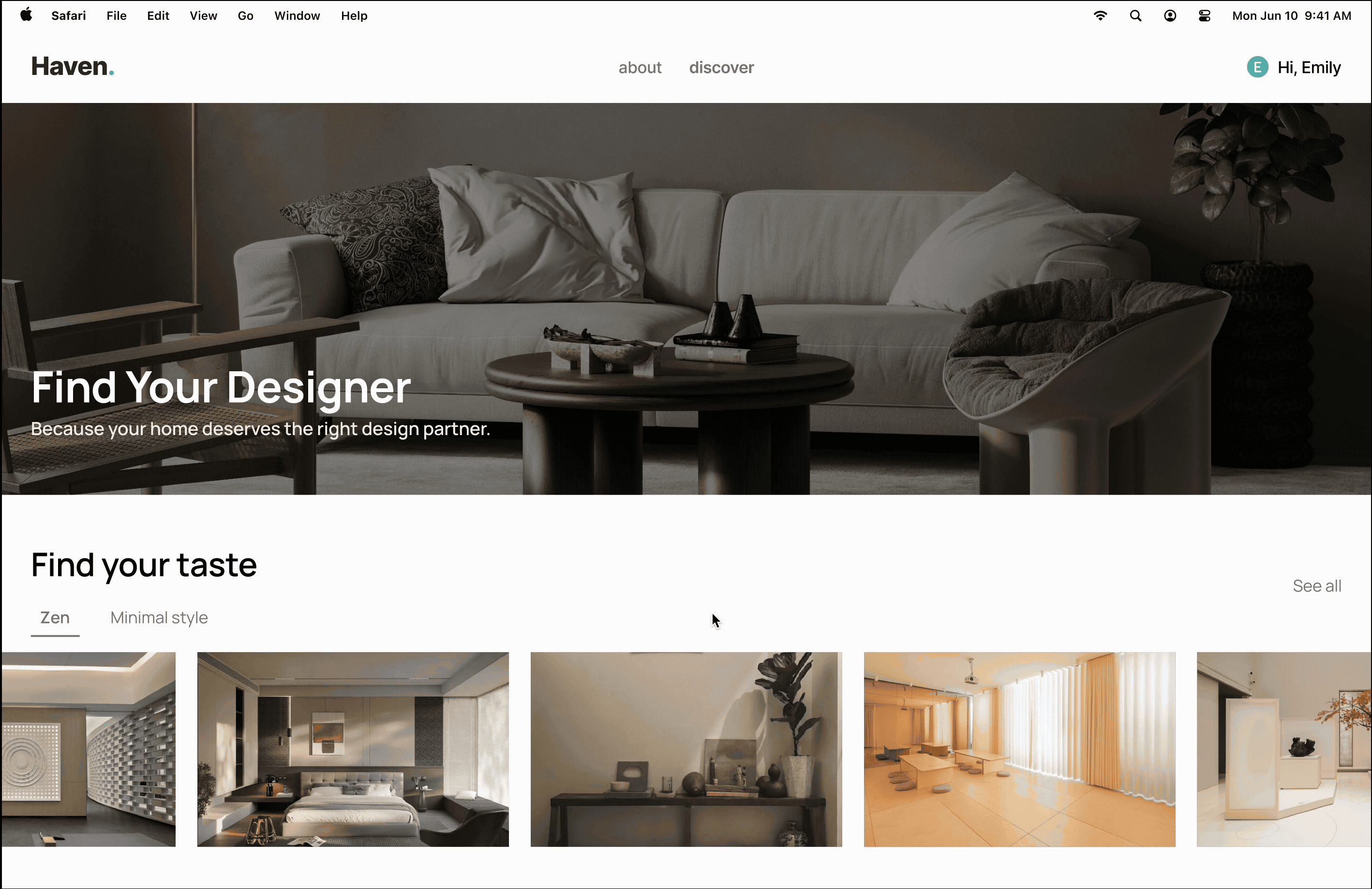
A visual style quiz removes the need for design vocabulary, while budget framing uses ZIP code and project type to make expectations feel concrete. We also explored generating an isometric room from a moodboard so someone’s taste feels real before they talk to a designer.

Matching
Designers are shown side by side with project history, budget fit, reviews, and past client feedback surfaced upfront, so homeowners aren’t judging designers on photos alone.
My role was…
I built the quiz questions around two things homeowners actually needed to resolve early: trust, meaning would this designer get their taste, and customization, meaning how specific their style preferences could get without needing design vocabulary. That's what shaped which questions made the cut and which felt like noise.
Looking back…
Protothon reinforced how much a good problem statement matters under time pressure. The moment we reframed the challenge from "help people find a designer" to "help people decide," the rest of the design followed naturally.
A judge specifically called out our onboarding flow as clean and well-executed, but scored the overall UI design as needing improvement, which tracked with how little time we had.
Given the timeline, we moved from research directly into high-fidelity Figma screens rather than testing the onboarding flow with real users first. With more time, that's the first thing I'd want to validate, whether the visual taste flow actually produces matches homeowners trust.n here.